#product_redesign
#ux_strategy
#mobile

Fixing the core: Calendar redesign

contribution

  • Research
  • Accessibility audit
  • Redesign of core functionality
  • Сolor system upgrade
  • Dark mode design
  • UI testing
  • Documentation

Team

  • Product designer (me)
  • Product owner
  • Backend developer
  • Flutter developer
  • QA engeneer

Timeline

  • Autumn 2024 - Spring 2025

overview

Hoopit is a Norwegian SaaS platform serving over 200,000 users across sports clubs and organizations. It enables club managers and team leaders to handle daily operations such as event scheduling and financial administration, while players and parents use it to join events, communicate, share updates, and manage memberships. The platform operates across two environments: a web-based admin panel and a mobile app.
In this case study, I outline how a strategic redesign of the mobile app’s main screen, the Calendar page, contributed to a 20% increase in NPS and improved overall user satisfaction.

problem

Chain of cause and effect
The app’s core feature, the Calendar, suffered from major usability issues that created friction in daily operations. Team administrators, responsible for creating and managing events, were most affected. Their frustration escalated to board and club-level administrators, the key decision-makers, which in some cases led sport clubs to migrate to competing platforms.

research

Tracing the source of user pain
To address the issue, I conducted a comprehensive investigation to identify the root causes of user frustration.
I analyzed all Calendar-related feedback collected by the support team, categorizing recurring complaints and behavioral patterns in a Notion board to define key usability problems.
I then gathered insights from the product and engineering teams to clarify technical limitations contributing to those issues.
Finally, I performed a competitive analysis, examining how similar platforms handled event management workflows that were problematic for our users.

insights

Translating research into actionable insights
Research revealed that most frustrations stemmed from 3 areas, and understanding them informed key product and design decisions.
1. Performance issues
Calendar interactions were slow, sometimes taking several minutes to update, and recurring bugs further undermined user trust.
Decision
  • Optimize performance and loading speed.
  • Ensure that the Calendar always accurately reflects user responses to event invitations.
2. Unclear communication through design
Event cards provided insufficient or unclear information, forcing users to open each event for context. This added step increased frustration, especially given the performance issues noted earlier.
Decision
Users should be able to access key information about an event without opening its details:
  • Who is invited and their response.
  • Core event information such as title, time, location, and group.
  • Complete response statistics for trainers, including accepted, not answered, and declined participants.
3. Poor visual quality and accessibility
Overly bold colors, insufficient contrast, and poor UI quality increased user frustration and further reduced overall satisfaction with the app.
Decision
Establish a cleaner, accessible visual system with balanced color usage and improved contrast.

process

Stage 1: Low-cost, high-value improvements
With key requirements defined, the next step was to translate them into a structured process. To balance impact, effort, and risk, the work was divided into 2 stages.
The first stage focused on targeted improvements with minimal implementation cost. The goal was to deliver immediate value while establishing a strong foundation for the full redesign.
Objectives
  • Improve perceived quality and user satisfaction with minimal development effort.
  • Resolve major visual pain points in the Calendar.
  • Establish a scalable, token-based color system to ensure consistency and simplify future updates.
Outcomes
  • Reduced user frustration: Adjusted contrast and color intensity, addressing two of the most reported Calendar issues.
  • Improved system scalability and cross-platform consistency: Migrated to Figma tokens, replacing static styles with a tokenized color structure, enabling better maintainability, dark mode support, and full alignment between design and development.
  • Delivered a highly requested feature with minimal effort: Implemented dark mode, satisfying user demand and reducing support requests, leveraging the new color architecture for efficient rollout.

process

Stage 2: Redesigning the calendar experience
The second stage addressed the critical issues with the Calendar’s performance and usability identified during research, focusing on improving efficiency, clarity, and overall trust in the core scheduling experience.
Rethinking event communication
I started by addressing how event information was communicated.
Using earlier event card explorations from a previous feature (“Unanswered events”), I tested multiple UI directions that intentionally diverged from the existing design.
Some concepts were inspired by a competitor’s Calendar that users frequently mentioned as more intuitive.
Through these explorations, I evaluated different ways to structure event data while measuring how much visual and interaction change the product could sustain without compromising usability or recognition.
Refining the existing UI
After testing alternative directions, I decided to return to the existing visual structure and refine it instead of replacing it entirely.
I reintroduced the color-coded team association to preserve familiarity and maintain the app’s visual liveliness.
From there, I focused on resolving all key communication gaps:
  • Added invited users with per-user response indicators (“check” or “x”) for clarity.
  • Improved how event time and location are displayed. If a meetup time or location is defined, it now replaces the original event info to reflect what’s most relevant.
  • Redesigned attendance statistics to show total counts of accepted, unanswered, and declined participants, visually linked to corresponding icons.
  • Replaced the “trophy” icon with a “Match” label to make this event type clearer and more immediately recognizable.
These refinements preserved what users already recognized while eliminating the usability and clarity issues that caused daily friction.
Covering all use cases
After finalizing the event card structure, I validated its adaptability across different use cases. I mapped every event type, participant role, and state variation in a detailed matrix to ensure that the design scaled consistently across all contexts.
This process revealed several edge cases such as mixed-role events or missing participant data that required layout adjustments.
By systematically addressing each case, I ensured the new design stayed functional, responsive, and visually consistent across all use case scenarios.
Documenting the logic
I documented every design and logic decision, specifying when and how each data point should appear and update under different conditions.
Without a business analyst on the project, this documentation filled a critical gap, aligning product, design, and engineering understanding. It ensured consistency in implementation, reduced ambiguity during development, and enabled future contributors to trace design rationale without guesswork.
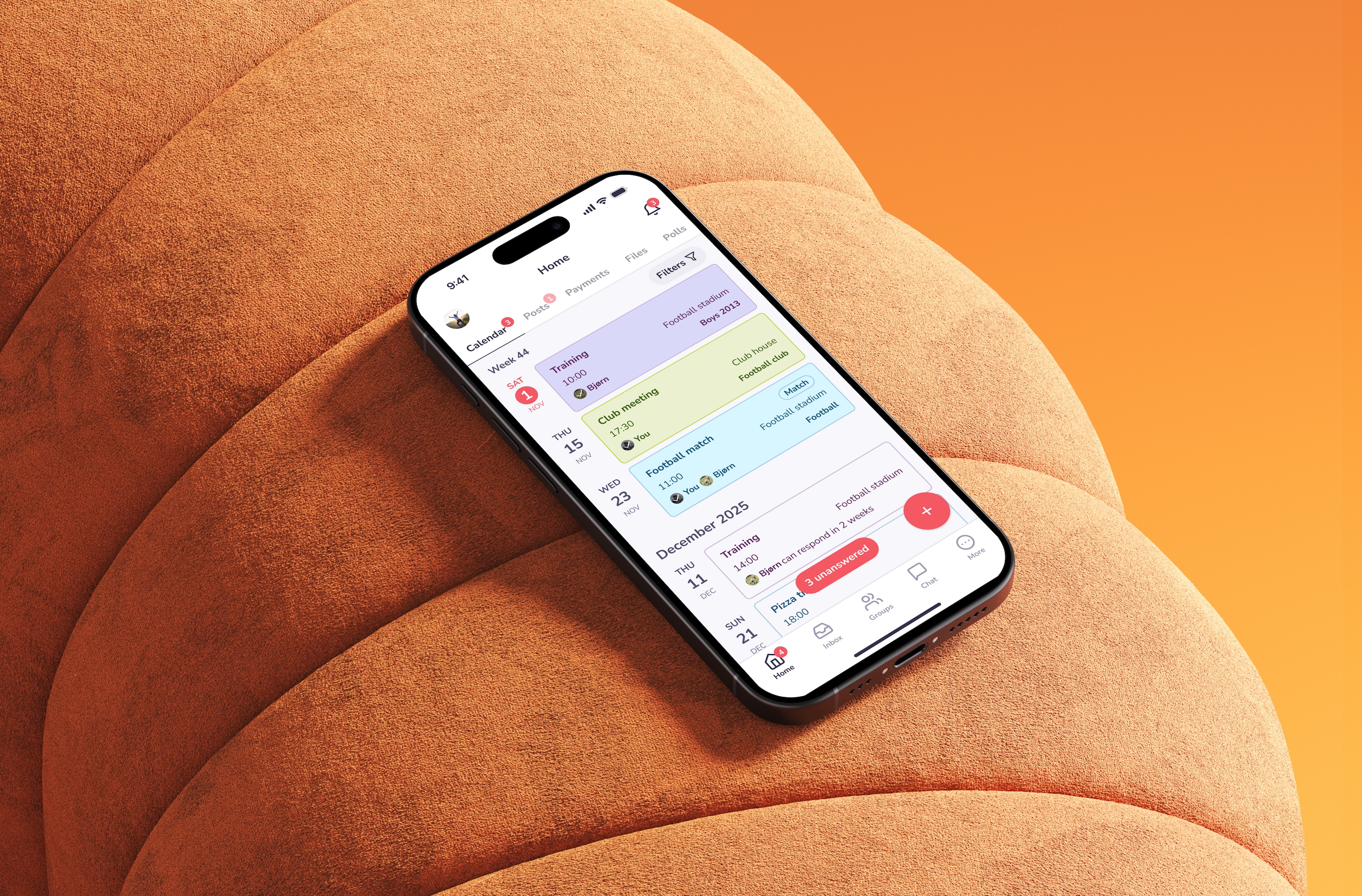
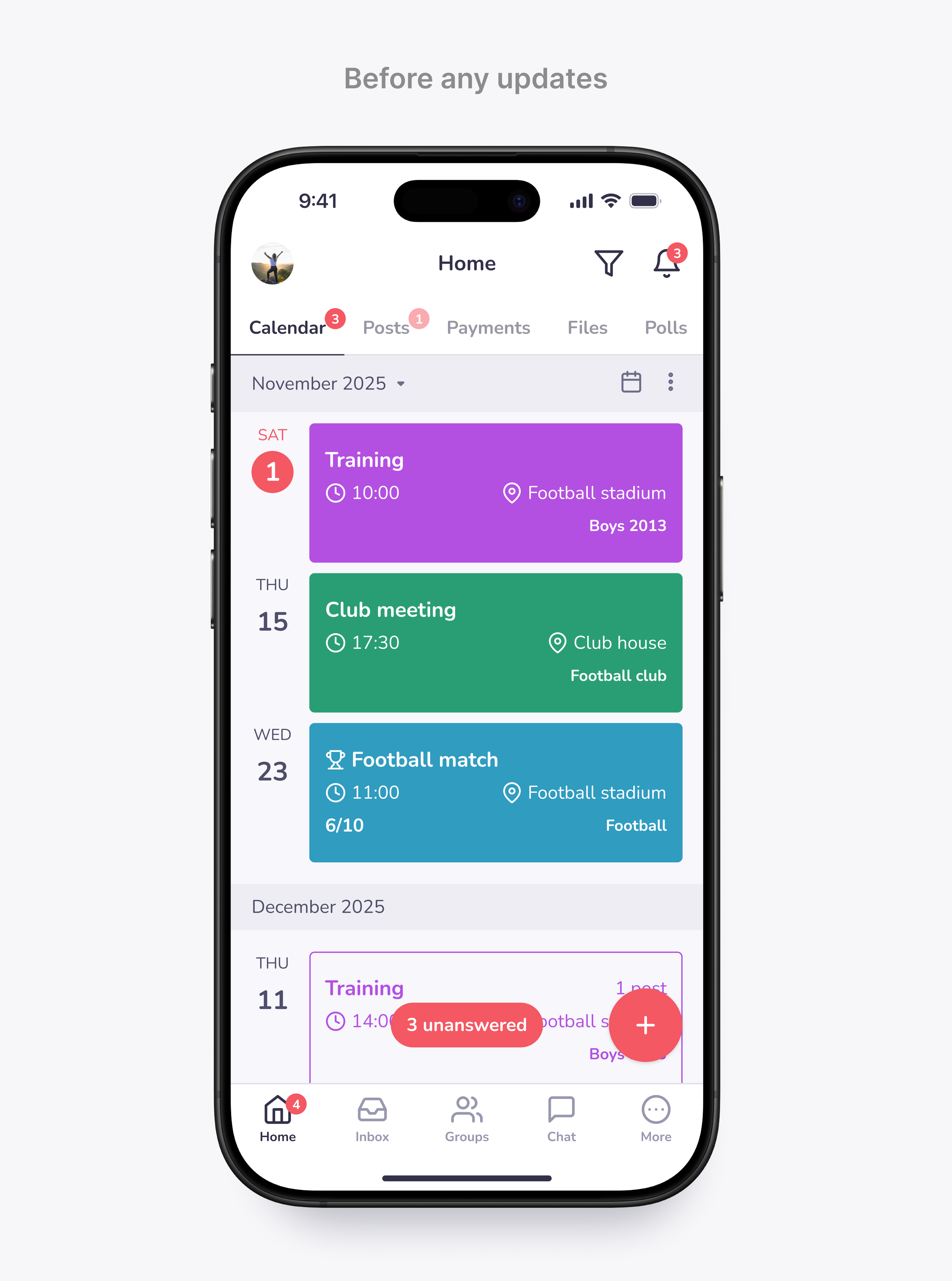
Optimizing structure and filtering for performance
Previously, all events loaded into a single continuous list, leading to long load times and degraded performance. I restructured the Calendar into two logical views: upcoming and past events. This separation, combined with backend optimization, significantly reduced latency and improved overall responsiveness.
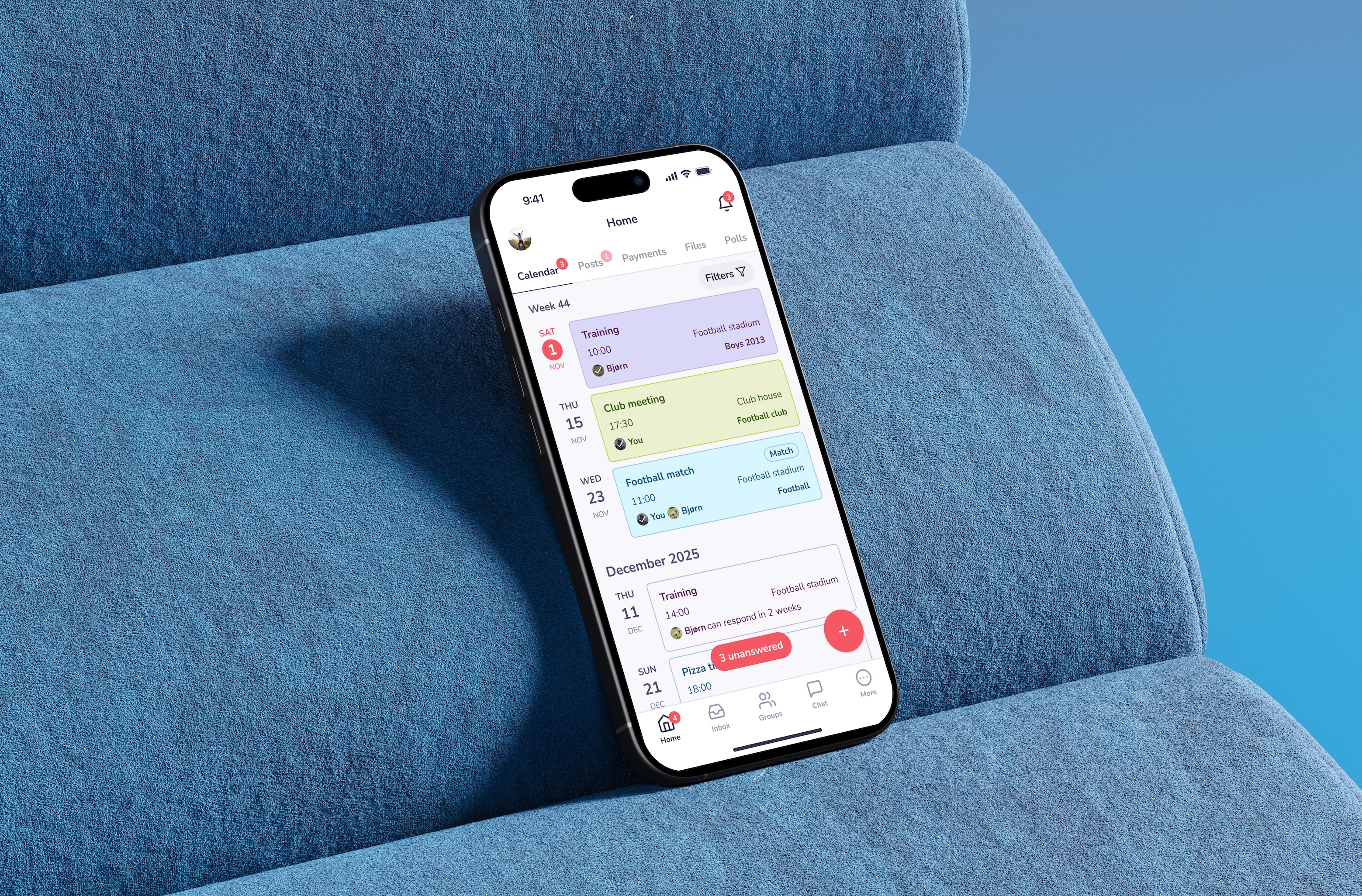
I also redesigned the filter experience for consistency and efficiency. Filters were moved from a separate page into a bottom sheet, aligning with global interaction patterns in the app. New options, such as “Show events you are not invited to,” expanded user control and improved event visibility without adding cognitive load.
Implementation and QA
After the redesign, the team replaced the third-party calendar library with an in-house solution. The previous library had limited UI flexibility, frequent bugs, and slow event state updates. Moving to an internal implementation removed these constraints, enabling full execution of the new design and improving data synchronization reliability.
Once the implementation was complete, I conducted multiple rounds of UI testing to verify that the Calendar matched design specifications. I documented and reported all issues directly to the developer, providing visual and behavioral references. This process ensured precise alignment between design and final product, delivering a polished and fully functional Calendar experience.
Outcomes
  • Resolved core usability issues and improved information clarity: Redesigned event cards to surface key details, including participant responses, event times and locations, and attendance statistics, eliminating previous friction and reducing reliance on opening individual events.
  • Enhanced performance and reliability: Restructured Calendar into past and upcoming views, optimized backend interactions, and replaced the third-party library with an in-house solution, resulting in faster load times and consistent event state updates.
  • Expanded user control and accessibility: Redesigned filters and added new options, improving discoverability of events and aligning the interface with established app patterns.

impact

Design-led product transformation
All the described efforts not only improved usability for the Calendar, a core app feature, but also enhanced system quality and long-term product scalability.
Replacing the third-party calendar library with an in-house implementation reduced bugs, improved event update speed and reliability, and lowered support requests.
Migrating to Figma Tokens fully aligned design and development systems, improving maintainability and enabling seamless dark mode implementation.
User satisfaction
  • Calendar-related complaints dropped significantly, reflecting smoother daily use.
  • Users praised the improved color system for clarity and readability.
  • Dark mode, one of the most requested features, was adopted widely without follow-up issues, signaling strong acceptance.
System reliability and performance
  • In-house calendar implementation eliminated recurring bugs and improved loading speed.
  • Post-launch monitoring confirmed stable, reliable operation with no new calendar-related issues.
Design and product alignment
  • Tokenized color system unified design and development, reducing inconsistencies and simplifying future updates.
  • The redesign strengthened the Calendar’s role in meeting core user needs, enabling the product team to prioritize additional event management improvements confidently.
Together, these outcomes contributed to a 20% increase in NPS, fewer user complaints, and reduced support tickets.
These efforts demonstrate how research-driven, strategically sequenced improvements can deliver immediate user value while creating a foundation for sustainable product growth.
#ux/ui_design
#design_systems
#research
Want to work together?
#ideas
#memes
#ui_inspo
Just want to chat?